BRAND
APPLICATION RULES
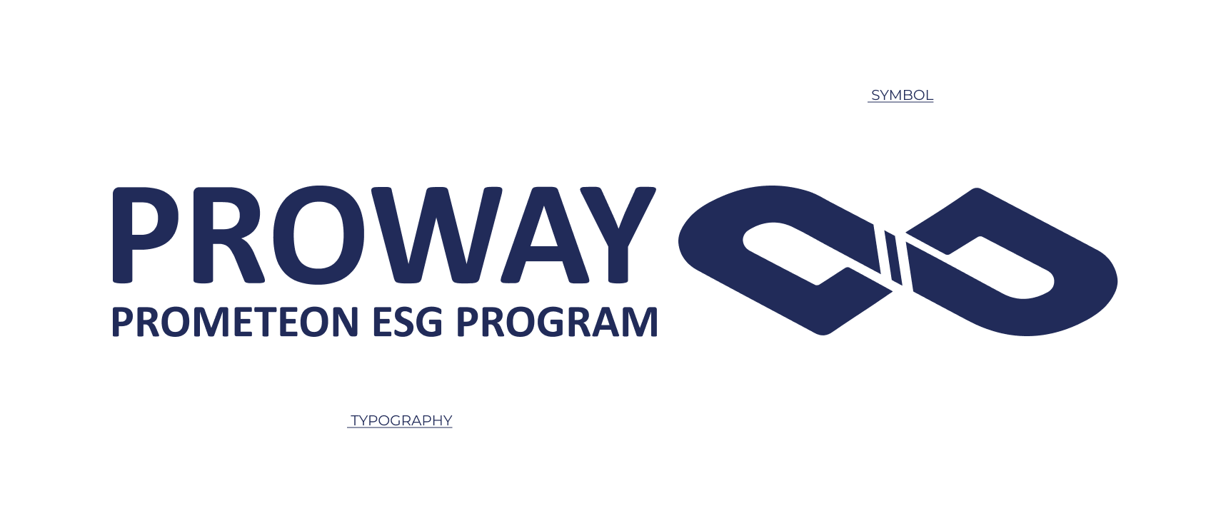
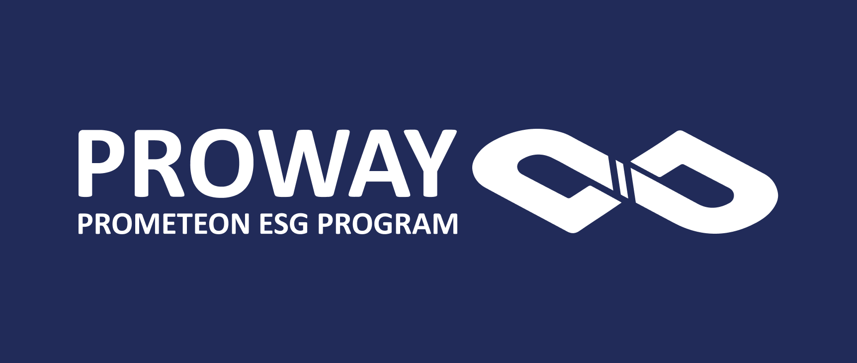
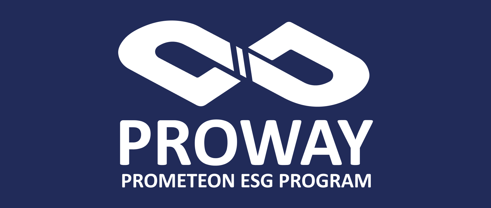
The brand is the central element of a visual identity. It must be well used to become the primary brand recognition item in the shortest time and space. Our main signature is formed by the symbol and typography. Preferably in institutional color on a white background, always respecting the rules.
SUBSCRIPTIONS
There are two configuration possibilities for using the brand: horizontal and vertical. Knowing that horizontal application must be a priority.

HORIZONTAL | POSITIVE

VERTICAL | POSITIVE
HORIZONTAL | NEGATIVE
VERTICAL | NEGATIVE
CONSTRUCTION MESH
The brand configuration depends on the spacing and alignment between the symbol and the typography, both were studied for the best possibility of leaving the brand light, fast and fluid. The brand geometry diagram should always be followed, and redesigning the brand is strictly prohibited.
SIZING
To ensure the legibility of the logo, it is necessary to establish the maximum reduction for signatures. When the reduction is necessary, the proportions of the elements must be respected.

PROTECTION AREA
The protection area is necessary to preserve the visibility and readability of the brand, avoiding the excessive approximation of another brand.
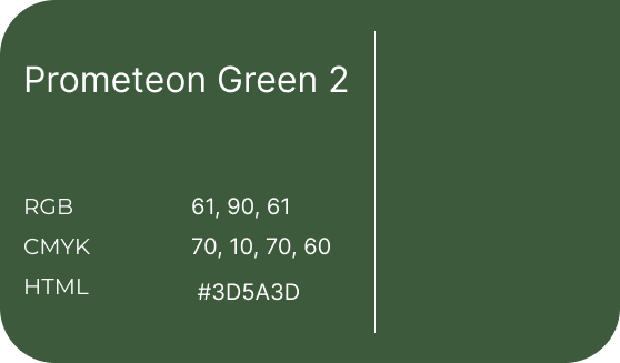
COLOR SCHEME
The colors chosen to be applied in the signature are part of Prometeon's visual identity to maintain a standard of language in both.
STANDARD ALPHABET
The same happens with the typography, the standard font of the Prometeon brand identity was used, maintaining a continuous language in both.