PROMETEON ESG PROGRAM
PROWAY
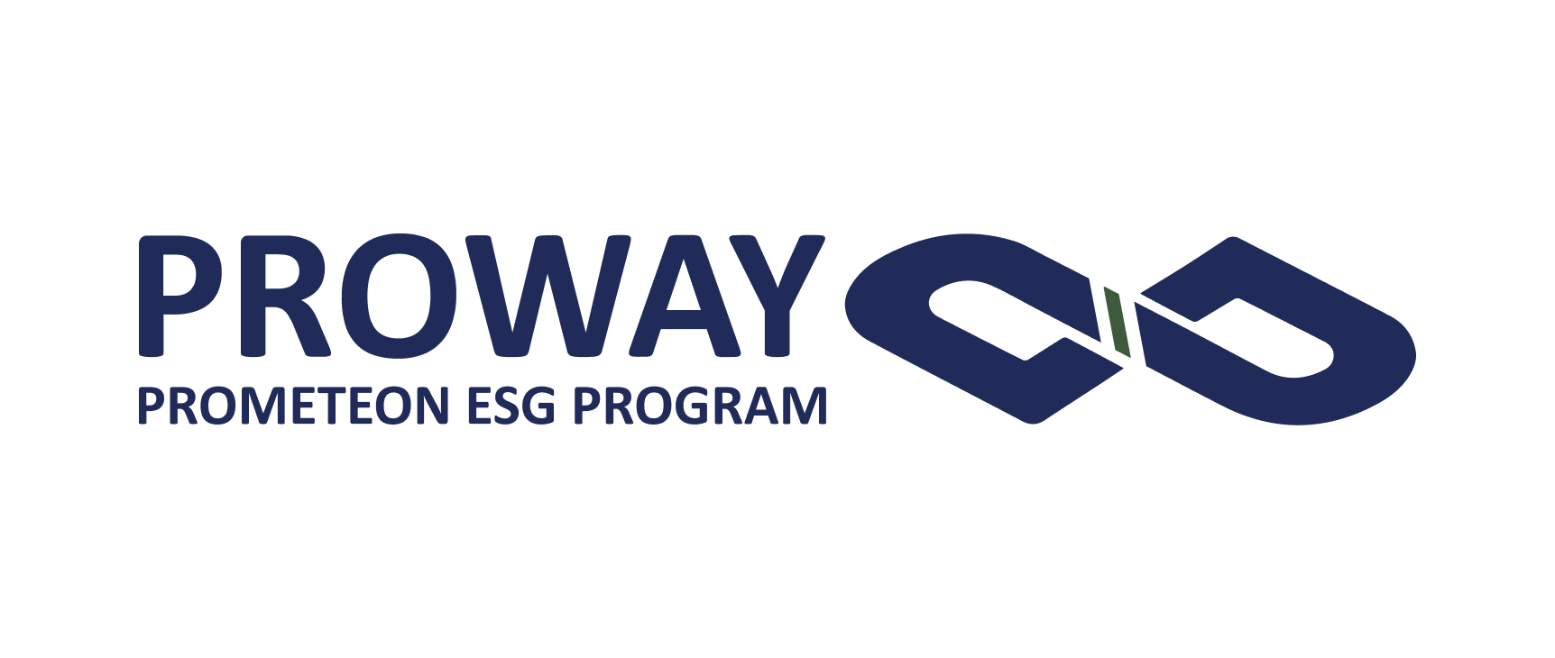
The construction of its visual identity was based on symbols. In the contemporary world we are surrounded by symbols with countless meanings consolidated over time. The goal is for the program to become a global symbol of responsibility and innovation.
CONSTRUCTION
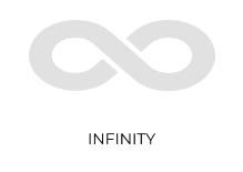
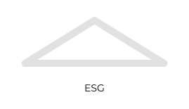
Following the line of generating a graphic symbol, three concepts were chosen to be integrated into the identity. The connection with Prometeon, the brand that generated the program, is represented by the letter P present in the Brand Typology. The concept of timelessness, the awareness of all generations for the future is represented by the infinity icon. The third concept is ESG, the three pillars that drive the program.

The final result of the symbol through the union of concepts is fluid and simplified. The feeling of continuation and a certain three-dimensionality brings a contemporary air to the brand and reaches all age groups.
SIGNATURE VARIATIONS
The variations can be applied in application situations for dissemination and marketing, but the priority is the main horizontal logo that must be predominant in the applications.


.png)